Customizing your area chart
Prior to publishing your area chart and after you have successfully uploaded your data, there are many available features in the chart editor that you can use to tweak your area chart and enhance the quality of your data visualization.
Index
Refine
Horizontal axis
Continuing our work with the area chart on carbon emissions, we first head over to "Refine" tab. In the first and second panel, you can configure the horizontal axis and vertical axis. Let's start with the horizontal axis. For this axis, you should select the column in your data that has the time data (dates, years, time stamps, etc.). We choose the column "Year" for our horizontal axis.
Some other settings in this panel include:
- Custom range: useful for showing a time range other than the one that is automatically displayed. You can extend your time range (e.g. if you have data for the years 2000 to 2016, you could extend the range to 1990 to 2020), but you can't limit the time range. Datawrapper will always show the entire time range that it can find in your data. Even if you choose the time range 2013 to 2016, our tool will still show you the data (and therefore the time range) between 2000 and 2016. If you want to limit the time range, you need to delete data, e.g. in step 1: Upload data.
- Custom ticks: Here you can decide on the number of ticks you want to see. If you type in "2000, 2005, 2006", only three gridlines will appear at the horizontal axis.
- Tick format: Here you can decide which kind of ticks you want to see. We have quarters data and two options in the drop-down: "2015 Q1, 2015 Q2" and "2015, Q2, Q3". If we choose the first option, we will see ticks like "2015 Q1" and "2016 Q4" below our axis. Datawrapper won't display ticks for each of our quarters, because the space is too limited to do so. A better idea is the "2015, Q2, Q3" option: This will display just years below the axis (2014, 2015, 2016 etc.), but we will see the quarters in the tooltips: "2014 Q1" for example.
- Gridlines: This setting is straightforward: Do you want to show the vertical axis grid lines or hide them altogether? There's also this option of showing vertical gridlines only as tick marks right above the labels on y-axis. Whichever option you choose depends on your personal preference and how much data you have on the chart. Below is a screenshot of how the panel looks like at the end:

Vertical axis
The settings in the second panel are very similar to the settings in the first one. There are only two different settings:
- Custom range and custom ticks: See ''Horizontal Axis''
- Number format: Here we can decide how our values are shown in the tooltips. Here are three examples:
- Choose the number format "123.4k" if you have big numbers like "1,303,428" that you'd rather want to display as "1.3m"
- Choose the number format "0.0" if you have very detailed numbers like "0.1922302" and you'd rather show them as "0.2"
- Choose the number format "0%" or "0.0%" if you have a number that is a relative number. This setting will add a percentage sign.
- Gridlines: See ''Horizontal Axis''
- Grid labels: Here you can decide on the design of your grid labels. Should the labelling stand outside or inside the line, or should this be governed by the available space ("automatic"?). You can also decide if the grid labels should appear on the left or right side of the chart.
For our chart , the panel looks like this at the end:

Customize area
The most important setting of the panel "Customize lines" is choosing colors for our areas. We can choose one color for all our areas (click on the color panel next to "Base color" to change the default color) – all areas will then appear in this color and its shades. We can also adjust the colors manually for each area. To do so, click on "customize colors" next to the base color:

Below, we can change the opacity, sort areas, separate areas with white lines and change the interpolation. Interpolation refers to how Datawrapper draws lines between the available data points. To read more about when to choose which interpolation, visit our blog post.

We can also choose to stack or unstack areas: Stacked means that all areas are on top of each other. If we deselect this setting, all areas will lay behind each other. This is harder to read and only a great option in a few cases, so "Stack areas" is selected by default in our tool.
And you can stack areas to 100 percent: Your chart won't show absolute values anymore, but relative ones. You can create a 100 percent area chart. Depending on your data, this might make for a more interesting chart:

Labeling
In this fourth and last label, we can decide if we want to display the area labels ("Solid fuel", "Liquid fuel" etc.) at the top or not at all.
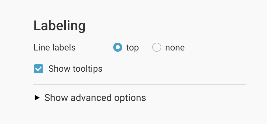
You can also choose whether to show tooltips or not as well as the option to format your tooltips:

Annotate
In the Annotate tab, you're first asked to give your visualization a title, description, notes, source, byline, and an alternative description for screen readers. You can find a detailed explanation of all these Annotate options here.
Text annotations
Our text annotations feature lets you set text everywhere on your area chart. Learn how to create text annotations here.
Highlight value ranges
If we want to draw our reader's attention to one specific time range, this tool is perfect. It lets us set greyed-out ranges directly in our chart. To do so, click on "Add range highlight". Now simply select a starting and ending point of the range by clicking in the chart. If you want, you can also change the opacity of the highlighted range: 
Layout
In the Layout tab, you can select an output locale, change the design theme and footer options, and enable social sharing. Find a detailed explanation of all the Layout options here.
Publish
In this last step, you can select a preset layout and enable social sharing functions to spread your work. Click on " Publish" and you'll be directed to the "Publish & Embed" page.
The best way to use a Datawrapper chart is by embedding it directly on your website. To do that, click the big blue button that says "Publish Chart". Then, copy & paste the embed code snippet into your website or CMS. You can also download your chart as a PNG (available to all users regardless of the type of subscription plan they have) or a PDF (available only to users of Custom or Enterprise plan). For more information on the different pricing plans, click here.