How to read a histogram, min, max, median & mean

Datawrapper offers powerful tools to understand your numeric data. If you are in step 2: Describe, you can click on the header of any column with numbers to display a histogram of values, including their minimum, maximum, median, mean, and the number of potentially invalid values. Here's a quick explanation of what all of those words mean. Scroll down to get more in-depth explanations with examples.
- Value distribution or histogram: Shows how the values in your column are distributed. The higher the bar, the more values fall in that range.
- Min and max: Shows you the lowest (minimum) and highest (maximum) values in your column.
- Mean: Also called the average. The sum of all the values in your column divided by the total number of values.
- Median: The number that would be in the middle of an ordered list of your values. Unlike the mean, the median isn't affected by outlier values.
Let's introduce some sample data. We have 101 rows in each column. The column "Berries" is filled with numbers from 0 to 100. The column "Lemons" is filled with numbers from 0 to 95 and with five "5000"s. The column "Apples" is filled with random data between 0 and 100.
| Berries |
Lemons | Apples |
| 0 | 0 | 58.32864768 |
| 1 | 1 | 48.45585765 |
| 2 | 2 | 94.03562691 |
| 3 | ... | 12.33567972 |
| 4 | 94 | 62.16973429 |
| 5 | 95 | 33.46912268 |
| ... | 5000 | 7.506870755 |
| 97 | 5000 | 45.94068342 |
| 98 | 5000 | 29.94451574 |
| 99 | 5000 | 88.70147353 |
| 100 | 5000 | 51.67053301 |
Value distribution (histogram)
The histogram is a chart that tells us how the values in the selected column are distributed. This is great for understanding which values occur more or less often: Which salaries are most common, which survey replies were chosen the least, or which range of unemployment rates most counties have to deal with.
Here's how it works: A histogram automatically creates equally-sized bins between our lowest and highest values and tells us how many values fall within each bin. The higher the bar, the more values fall in that bin.
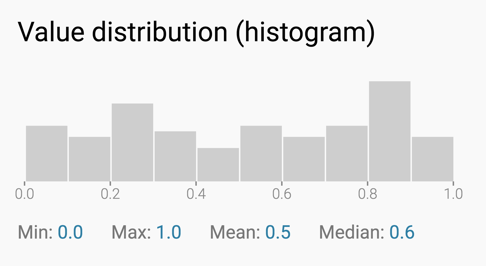
That's the histogram of our random data (Apples):

We can see that most of the values in this column fall between 80 and 90.
Attention: The values 80 and 89.99999 counts as part of this range between 80 and 90. But the value 90 counts as part of the last range; the one between 90 and 100. This is true for all values except the highest value, 100. To not create a new range just for this one value, 100 counts as part of the 90 to 100 range. We can see this better when we ask Datawrapper to show us the histogram for Berries:

Berries contains 101 values. The values 0 to 9.999 are in the first range; the values 10 to 19.999 are in the second range and the values 90 to 99.9999 plus the value 100 are in the last range. You can hover over the individual bars to check how many values fall in each range.
To understand that a histogram creates equally-sized ranges between the lowest and the highest value, let's look at the Lemons column. Because of its five outlier values of 5000, all the smaller values between 0 and 100 fall in a single 0-500 range:

Min and Max
The min and max tell you your column's lowest and highest values. This is pretty straightforward: The min for Berries and Lemons is zero; the max for Berries is 100, and the max for Lemons is 5000.
Mean and Median
The mean is the average that most of us are familiar with. It gets calculated like this: First, we sum up all our values. In the case of Berries, that's 0+1+2+3+4+5+...+99+100 = 5050. Then, we divide them by the number of values. We have 101 values in our Berries column, and 5050 divided by 101 is 50. That's our mean: 50.
Calculating the median is even simpler: We sort all the values in our head from low to high (1, 2, 3, 4, 5, ..., 99, 100). Then, we check the value in the center of that list. This value is our median. In the case of Berries, that's 50: The column has the same number of values lower than 50 and higher than 50.
For our Berries column, the mean and the median are the same number: 50. That's because the values in this column are very evenly distributed. Let's look at the Lemons column instead: 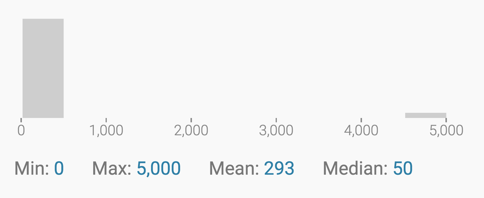
The mean of Lemons is 293 (!), but the median is still 50. That's because, when calculating the median, it doesn't matter if the higher values are very close to it or thousands of numbers away. The median just sorts all of the values and checks which one is in the middle. That's why the median is a useful measure: it ignores outliers.
This can be useful in many cases. For example, let's imagine a company with 101 employees, each one earning between $0 and $95. The company also has five bosses, who earn $5000 each. It wouldn't be fair to say that every person in this company makes about $300 (the mean salary). It would be closer to the truth to say that everyone earns about $50 (the median salary). When it comes to salaries, the median literally tells us what the "person in the middle" makes.
Pro tip: You can hover over the values for min, max, mean, and median to display them in the histogram: 
Invalid values
"Invalid values" is a number we only show you when you have invalid values. Most often, these are letters or words hidden in your column of numbers. Datawrapper tells you the absolute number of invalid values. It also shows you what percentage of the whole column is made up of invalid values. This percentage can help you decide if your data is usable or not.
Here's the Berries column with six invalid values:

We hope that this tutorial and the information we show with the histogram helped you understand your data better. If you still have questions, don't hesitate to go in touch with us at support@datawrapper.de.