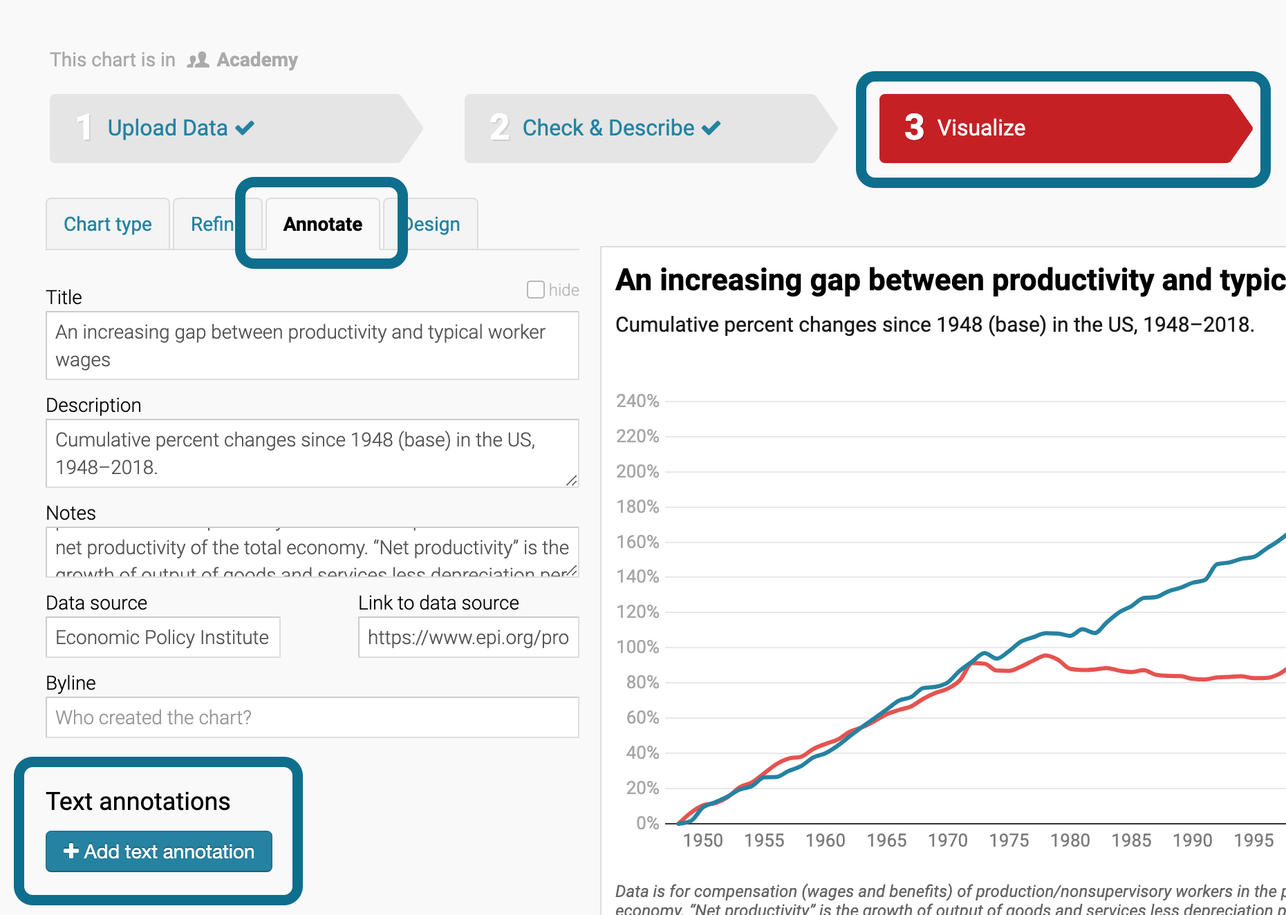
How to create text annotations
 You can create text annotations in many of our visualization types:
- in choropleth map and symbol map, e.g. to point out certain regions or spatial patterns, or to give context information.
- in column charts and stacked column charts, e.g. to highlight certain columns. Note that your data needs a date column to create annotations in these chart types.
- in line charts and area charts, e.g. to annotate long developments and surprising spikes
- in scatter plots, e.g. to lead the reader’s eye to outliers and general trends
No matter which map or chart you want to create a text annotation in, it always works the same. This article explains, how.
Index
- How to create text annotations
- Change the text of your annotation
- Format your text
- Change the position
- Change the width
- Change the anchor point (alignment)
- Add an offset for consistent spacing
- Show as key on mobile to improve readability
- Draw an arrow/line/circle to point to data elements
- Delete an annotation
How to create text annotations

- If you drag a text field open on your visualization, you will create an annotation without an arrow. (You can still create one later.)
- If you click on your visualization, your annotation will have an arrow. (You can still remove it later.)
No matter if you drag or click, you can immediately start typing to fill the annotation with your content.
Change the text of your annotation
You can change the text of your annotation in two ways:
- Double-click on an annotation and start typing. Click again – meaning, triple-click – or press Cmd+a to select the whole text and replace it.
- Select your annotation in the annotation list, then change the Text in the first text field.

To create a line break, simply hit Enter at the right position. The HTML command<br> will also work.
Format your text
Below the text field, you will find options to change the style of your text: Make it bold, underlined, or italic, change the text color, make it bigger or smaller, or add an outline to your text (in case it sits on gridlines or other data elements):

To format some parts of the text, you can do one of two things:
- Double-click on the text annotation in the visualization, select a part of the text, and press one of the following combinations on your keyboard:
- Cmd+b on Mac or Ctrl+b on Linux & Windows to make the text bold
- Cmd+u on Mac or Ctrl+u on Linux & Windows to underline it
- Cmd+i on Mac or Ctrl+i on Linux & Windows to make it italic
- Select an annotation in the annotation list, go in the text field and use any of the following HTML commands:
-
<b>text</b>to make the text bold <u>text</b>to underline it<i>text</b>; to make it italic<strike>text</strike>to place a strikethrough over the text<sub>text</sub>; for subscript text<sup>text</sup>for superscript text
-

To change the color of a part of your text, use a <span style="color:red">text<span> or do the same with <b style="color:red">text</b> You can use any HTML color name or a HEX color value:

Pro tip: Your annotations can have emojis 👋🎉. On a Mac, you can choose emojis by pressing Ctrl + Cmd + the space bar.
Change the position
To change the position after you placed an annotation, simply drag it around. Your annotation needs to be out of text-edit mode for that to work. If you're not sure, click on a free space somewhere in your visualization, and your annotation will be out of text-edit mode.
When dragging around the annotation, you will notice that the X and Y position of your annotation adjust. You can also change the position directly to place it exactly:

Change the width
To change the width of your annotation, change the value in the text box, or drag directly on the handles that appear when you place the mouse on top of a selected annotation. Note that the annotation has line breaks where possible:

The width of annotations is measured in chart/map width, not in absolute pixels. If your annotation width is 16% and a reader sees your chart on e.g. a tablet device instead of a desktop computer, the annotation will keep being 16% of the visualization width – which means that the annotation width will shrink or grow depending on the visualization width:

Change the anchor point (alignment)
To make sure your annotation extends in the right direction when your visualization becomes narrower (e.g. on mobile devices), Datawrapper lets you choose the position of the anchor point. This anchor point control can be tough to understand, but it's crucial to make sure that your annotation is nicely readable no matter the device your readers use.
The anchor point grid has nine options. You can click on any of the little squares to change the anchor point. Each of these anchor points defines the point from which your annotation "grows" as you as your visualization becomes wider or narrower.
 If you place an anchor point in the top left corner, the annotation will extend to the right and the bottom when your visualization gets resized. If you place an anchor point in the bottom right corner, the text grows to the top and the left.
That said, your annotation width is relative to the visualization width by default. So if you didn't set the annotation width to auto, the three left, center and right anchor points will only have an effect on the text alignment:
- the left three squares make your text left-align
- the center three squares make your text center-align
- the right tree squares make your text right-align

Note how you can see the position of the anchor point also in the annotation itself: A little pink square will appear in the position of your annotation.
If your Width isn't fixed, the top, middle, and bottom anchor points are far more important. But their consequence only becomes apparent when the width of your visualization or of your annotation changes:

Choose...
- the top three squares to make your annotation extend to the bottom. This is a good choice if you set the annotation right below an important data point.
- the center three squares to make your annotation in both directions, top and bottom. That's a good choice if there's a data element directly to the left or right, but lots of white space to the top and bottom.
- the bottom tree squares to make your annotation extend to the top. This is a good choice if you set the annotation right above an important data point.
If that sounds confusing, don't worry. Just play around – and always check how your visualization looks like on mobile and tablet devices. If it looks good, it will look good for your readers, too.
Add an offset for consistent spacing
Next to the anchor point "grid", you'll see two text fields. These let you add a margin (or "offset") to your annotation. That's helpful to create annotations that always have the same distance to a data point, no matter the device your readers see them on.
Let's say you create an 800px-wide column chart and place an annotation next to the tallest column. As soon as you check how your mobile readers will see the annotation (and you turned off "Show as key on mobile", see next section), you notice that the margin between the column and the annotation becomes way smaller:
 To change that, place the annotation directly next to the column and then use the offset to give it a margin. Positive values will move the annotation to the right or the top; negative values will move them to the left and the bottom:
 This way, the space between the column and the annotation will always be the same, no matter the visualization width:

Show as key on mobile to improve readability
Overlapping or cropped annotations are annoying for you and your readers. To make sure your readers can actually decipher your annotations even on mobile devices, they get numbered and move below the chart by default: 
If you want certain annotations to always show up directly in your visualization, disable Show as key on mobile in the annotation settings. That's what we did in this example with the “2019” label.

You can even change the order of how the annotations get numbered. Just drag them around in the annotation list:

Note that you can also decide to show or hide the annotation on mobile/desktop devices in general with a click on Mobile/Desktop:

Draw an arrow/line/circle to point to data elements
To draw a line next to your annotation, click Draw line to annotation text:
Note that drawing a line automatically introduces an offset. The line end (= the pink circle) is now described by the position values.
Here's how the place both the annotation and line where you need it:
- Change the position of your annotation by changing the offset values or by dragging your annotation around.
- Change the position of both the annotation and the line by changing the position values or by dragging it around while holding Ctrl.
Change the line type, line width, line end, distance to the actual "position", or apply the text color to the line to make the arrow/line look as you need it.
You can also draw a circle at the end of the line you just created, with a click on the toggle that says exactly that.
 Note that the circle size is not responsive, not even on maps. The circle is always the same size, no matter if the visualization width is 400px or 800px:

Delete an annotation
Finally, if you want to delete an annotation of yours, you can do so...
- either with a click on the red trash button in the annotation list...

- ...or by selecting Delete annotation at the bottom of your annotation settings.

If you have any more questions about annotations, let us know at support@datawrapper.de. We're looking forward to hearing from you.