How to show confidence intervals in Datawrapper column charts
Using a confidence interval to show how certain you are (or your data source is) about averages, or adding target markers, are great ways to show more nuance in your visualization. You can add both to Datawrapper column charts with the “overlays” option.
This article explains how to add confidence interval/error bars and value markers to Datawrapper column charts like in the example above. If you've never created a Datawrapper column chart before, we recommend reading How to create a column chart first.
How to show confidence intervals in column charts
Upload the data
First, our chart needs some data. To create a column chart with confidence intervals, you need to upload four columns:
- One with the categories. These will show up as the labels below the columns.
- One with the column values. These will be visualized as the height of the different columns.
- One with the lower bound of the confidence interval, and...
- ...one with the upper bound of the confidence interval. These two columns mark the minimum and maximum value of your overlay.
| Percent change | Min | Max | |
| White | 5.9 | 4.65 | 7.15 |
| White, not Hispanic | 5.7 | 4.45 | 6.95 |
| Black | 7.9 | 4.39 | 11.41 |
| Asian | 10.6 | 5.36 | 15.84 |
| Hispanic (any race) | 7.1 | 4.8 | 9.4 |
Upload your data in step 1: Upload data, then proceed to step 3: Visualize.
Prepare the column chart
Once you selected column chart as your visualization type, continue to the Refine tab. Here, make sure that the column with your column values is selected in the Select column dropdown:
Now you can customize your column chart to your liking; e.g. by changing the colors, label alignment, etc. You can find more information about this in our article Customizing your column chart.
Add the confidence interval overlay
To add the overlay that will work as your confidence interval, scroll all the way down in the Refine tab until you see the button Add overlay. Click on it. A few new options will open. Here, select Range.
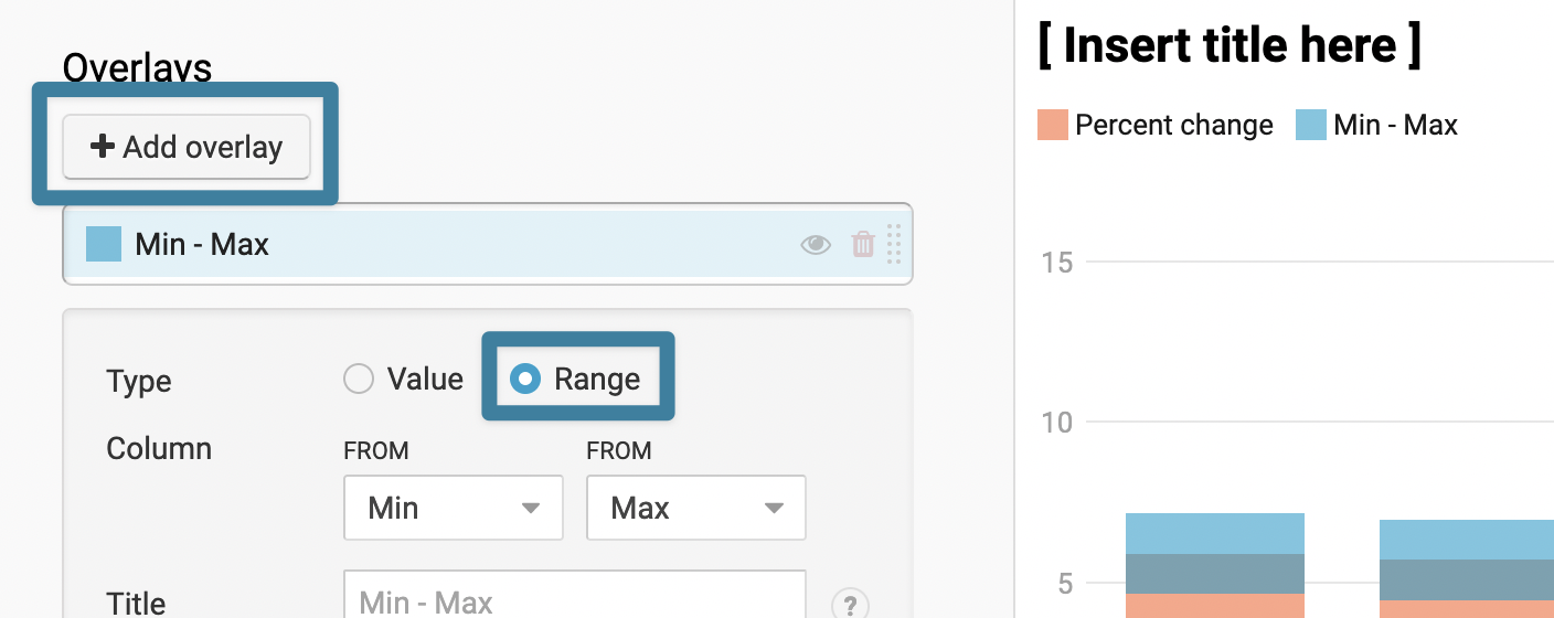
These are the options you have for the Range overlays:
- Column lets you select the two columns that you want to use as the lower and upper bound for the range overlay.
- Title lets you create a color key-like item above the chart that explains to your readers what exactly they see. Since there are different kinds of confidence intervals (90%, 95%) and value overlays can be used not just for error bars, we recommend making use of the Title.
- With Color, Opacity, and Pattern, you can change the appearance of the value overlay. Depending on how important the error bar is, you might want to decrease or increase the opacity. If your style guide prefers opaque colors, you can use the striped patterns to still create a look-through effect.


Avoid "Within-the-bar-bias"
In a 2014 study, Michael Correll and Michael Gleicher (PDF) found that people judge values inside the bar to be more likely than values outside the column (when a classical error bar is used). This is called "within-the-bar-bias".
After adding an overlay, ask yourself: Which values would you judge as more likely when seeing this visualization? Can you change the opacity, color, or pattern of the overlay to work against within-the-bar bias?
You could also make the column completely transparent (e.g. with the hex code #ffffff00) to just show the ranges. This way, they look similarly important on both sides:
If you have any questions about creating confidence intervals in column charts, don't hesitate to get in touch with us at support@datawrapper.de.