How to create a heatmap
 With our Datawrapper tables, you can create heatmaps like the one above. Heatmaps help your readers to see patterns in your tables. They color each cell in your table according to the underlying value.
In this article, you'll learn first how to create the following heatmap, and then how to create the heatmap you see in the image above. Let's start with creating this heatmap first:
Index
- How to create a heatmap
- How to show heatmaps on text columns
- How to have narrow columns, but still show a header
- How to hide the header but show column header values in the tooltips
1. How to create a heatmap
First, create a normal table as you're used to. Upload your data, and select Table in step 3: Visualize. 
You can also style the table as you need it. Here we made the table searchable and sorted the table by the January column. 
Now select the numerical column(s) you want to turn into a heatmap. Then select Show as heat map in the column options below:
Note how the gradient automatically adjusts itself to the minimum and maximum number in the selected columns.
When you turn on the heatmap for your columns, you can still use all other table options. You can sort "heatmapped" columns, format them, change their column width, add a border – even add bar charts on top of the heatmap coloring.
You can also change the color palette: Scroll all the way down in the Refine tab to find the Heatmap section.
Here you can
- select another color palette. There's also a way to adjust the color palette and add your own colors. Find out how to do so in our Academy article "How to use the color palette tool".
- choose a stepped or continuous type. Steps show all the values within a certain range with the same color. Continous assigns each value an own color on a gradient.
- choose the Interpolation. Read more about that topic in our Blog article "How to choose an interpolation for your color scale".
- decide on a custom range. By default, Datawrapper sets the range between your smallest and highest value. You can decide to extend or shorten that range. Simply enter another number in the min, center or max field.
- Hide values in heat map columns. This way, your readers won't be able to see the underlying values anymore, so it makes sense to turn on the option Show values in tooltips instead.
- Show a color legend. You can find a full explanation of all the settings that appear as soon as you decide to show a color legend in our Academy article "How to customize your color legend".
And that's it! You know created a heatmap in our Datawrapper tables.
2. How to show heatmaps on text columns
As we've seen so far, heatmaps work on numerical columns. But there is a way to make them work on text columns, too: by adding a number.
To do so, edit your data by adding first @@ and then the number you want to see visualized as the heatmap (e.g. "1" for bright colors, "2" for medium dark colors and "3" for dark colors), without additional spaces.
👉 With the @@ notation, you also define the sort order of your columns. Learn more in this Academy article.
In the following table, we edited the Priority column to include that notation: Low@@1, Medium@@2, and High@@3:

In step 3: Visualize, you will now see the option Show as heatmap when you select a text columns with that @@-notation:

You can try it out yourself in the following table. Hover over it, then click on "Edit this chart" in the upper right to play around with it:
3. How to have narrow columns, but still show a header
To show these narrow columns, you need to hide the header or have empty header cells. If you leave all header cells empty except one of the first "heatmapped" columns and then use Merge with empty cells, you can create a header like this one:
Here's how this works in detail.
First, when preparing the data, place the label you want to see above the heatmap in the header cell of the first column. Leave all other header cells blank that belong to columns you want to turn into a heatmap:
Upload your data and turn on your heatmap as described above. Now select Merge with empty cells at the top:
And that's it.
1960 ~~~ 2016: 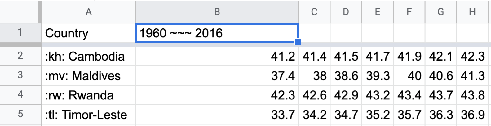 After checking Merge with empty cells, this will result in the following table header:

4. How to hide the header but show column header values in the tooltips
If you've followed the tutorial above, you'll notice that the tooltips will only display the life expectancy value (e.g."44") and will not show the corresponding years (e.g. "1966"). That's because, in order to create narrow columns, we left all the header cells blank. Well, in this last section, we'll explain a workaround that allows you to display both values:

First, when preparing the data, the first header row should contain all the values, in this case, the corresponding years (highlighted in green). This will be hidden later and will only be displayed in the tooltips. The second row in the dataset will become the header of the table. Between the columns Countries and 1960, add an extra row (Label) and place the label you want to see above the heatmap: 
Upload your data, turn on your heatmap and follow the steps explained in part 2 of this article.
Then hide the header by going to Customize header > Hide header: 
Then from Customize rows, select the second row in the dataset and format it into a header: 