How to control column widths in tables
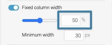
When customizing columns in Datawrapper tables, you'll encounter a setting called Fixed column width:

This is an important toggle as it allows you to control the width of a column. Here are answers to some frequently asked questions so you can understand how the feature works better:
I can't get a column to become narrower - why?
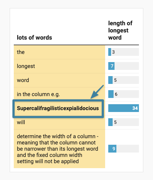
The column width will adjust to the longest word in the column. For example, let's say there's a long word like "supercalifragilisticexpialidocious" in one of the columns. In this case, the column would adjust to accommodate the word and will not be narrower the width of its longest word. So, if you're having trouble making a column narrower, search for the longest word(s) in the column and consider breaking up the word into several pieces by hyphenating them.

(In the image above, both columns are set to "50%" of the total width. But the following setting will be ignored because the minimum width determined by its longest word is wider than 50% of the total width.)

How do I make all columns the same width?
When you want the columns to be equal widths, then that's when the percentage slider comes in handy.
The slider at 20% means that the selected column will take up 20% of the total width, providing that none of the columns have super long words that would require more than 20% of the total width. (When you're doing this, it's a good idea to minimize the minimum-width px size. )
Now, the minimum width setting - this is important if you're using bars and sparklines within tables (if you don't know what this is, see here). These columns won't contain text that usually sets the minimum width of the column. This means they can be squeezed into nothing, or they can even look like they're reversed like in the table below if you make the screen size smaller:

Setting a min-width will prevent bars and sparklines from disappearing in narrower screen-sized devices. Also, consider using the mobile fallback option for better readability in mobile view.
