How to make locator maps look good on mobile devices
No matter where you embed your visualizations, it's almost certain that some of your audience — maybe a majority of your audience — will be accessing them on a mobile device. We should keep these readers in mind during the entire visualization process. Locator maps can be especially challenging to adapt for small screens. This article will explain how to check how your locator maps look on different devices and offer four tips for improving the mobile view.
You can see how your map will look on desktop, tablet, and mobile devices using the Responsive Preview buttons under the map.

You should check this often as you make your map. In fact, it's a good idea to spend most of your time in mobile view to make sure that your markers and labels fit on even the smallest screens.
How to make locator maps mobile-friendly
Our locator maps have features to make designing for mobile easier. Let's look at four design principles for smaller screens and learn how to implement them in Datawrapper.
- 1
-
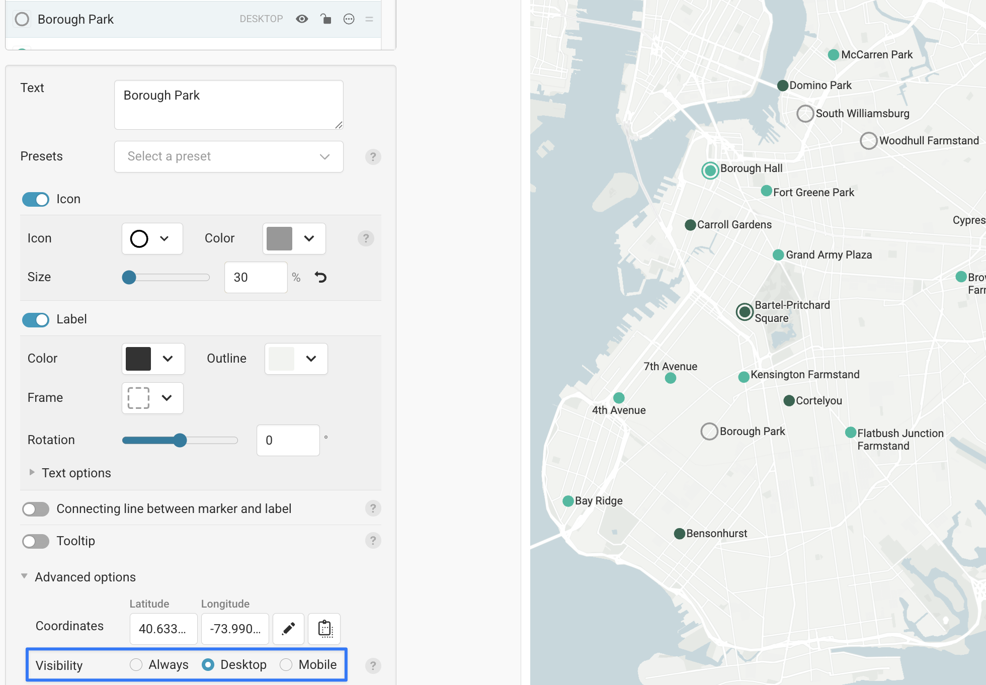
Use fewer markers
Smaller screens mean less space for map markers and labels — so you should focus on the ones that are absolutely necessary. Select a marker in step 1: Add markers and open the Advanced options button. Here you can change the visibility to be exclusively for Desktop. This will ensure the marker is only shown on larger screens, where there's enough room!
-
- 2
-
Use shorter alternative markers on mobile
You can use the same Visibility feature to create an alternative mobile version of a marker. To do so, first create a new copy of it using the duplicate button at the bottom of the marker panel.
-
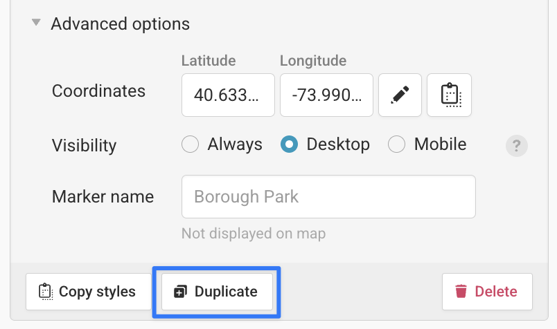
Select Visibility > Desktop to make your original marker desktop-only. Then select the new, copied marker and select Visibility > Mobile to make the new marker mobile-only. Now you have two separate markers, one for desktop and one for mobile.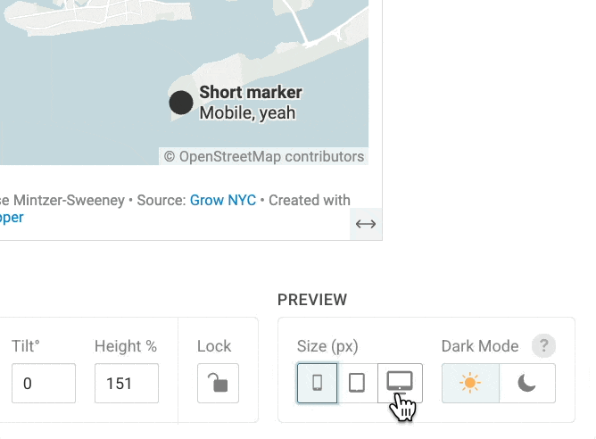 You can give the mobile-only marker a shorter label, or move some of its label information into a tooltip. You can learn more about locator map tooltips in this article.
 - 3
-
Use a narrow aspect ratio
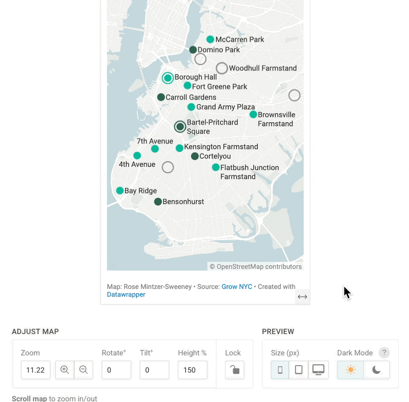
Compared to desktops, mobile screens are tall and thin. If your map is wider than it is tall, it might not show up well on a mobile device. You can adjust the dimensions of your map by clicking and dragging the bottom of the map area, or by adjusting the Height % control under the map.
An aspect ratio of 100 means your map is a perfect square. Increase the aspect ratio to make your map narrower and more mobile-friendly.
- 4
-
Use a key for longer labels
If your labels just won't fit on the map, consider using a key instead. You can find that option in step 3: Annotate & Layout, under Add key for markers.
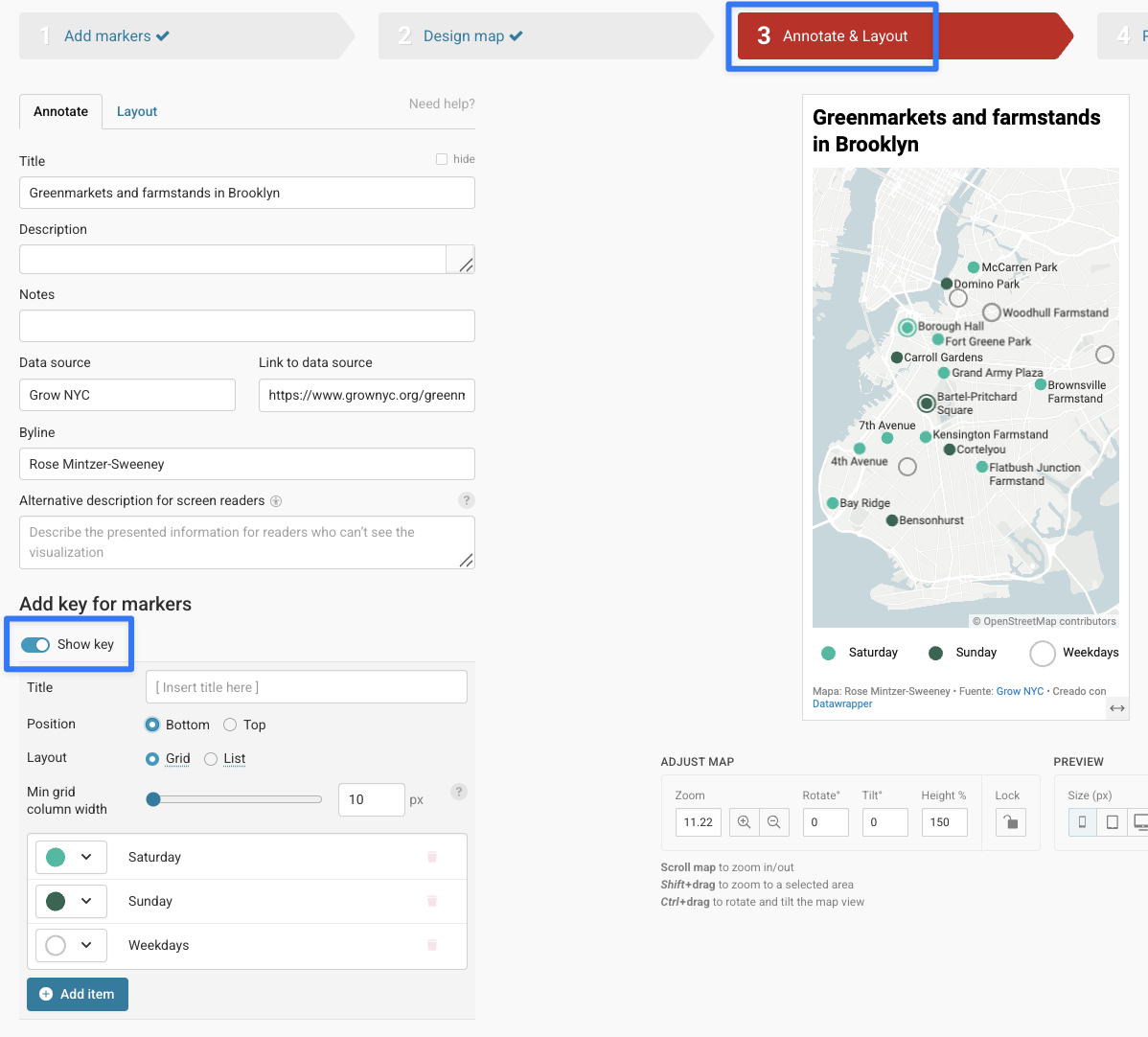 Now you can add labels that will show up in a key above or below your map. Keep in mind that if several of your markers share the same symbol, it won't be possible to label them separately in the key. You can learn more about locator map keys in this article.


 You can give the mobile-only marker a shorter label, or move some of its label information into a tooltip.
 Now you can add labels that will show up in a key above or below your map. Keep in mind that if several of your markers share the same symbol, it won't be possible to label them separately in the key.