How to create a bump chart
What is a bump chart? When should you use it? How do you create one in Datawrapper? In this tutorial, you'll learn how to create a bump chart like the one below (taken from this blog post here):
👉 This tutorial assumes you already know a bit about creating line charts in Datawrapper. If not, we suggest you read the following articles first:
What is a bump chart and when should you use it?
A bump chart (or a rank chart) is a great way to show rankings, and how they changed over time. It's especially useful when you want to draw attention to change in the rankings of multiple categories rather than their values themselves.
Use a bump chart if ranking is important. If you want to communicate not just the ranking but other variables such as the individual values, use another chart type like a line or an area chart. Bump charts are simple by nature and usually used to compare two dimensions.
How to create a bump chart in Datawrapper
Prepare the data
The dataset for the chart above looks something like this:  One column should contain dates (in this case years) and other columns should contain the different categories you're ranking against (in this case, chart types).
Click on the "Get the data" link at the bottom of the chart to download the full data to follow along.
- If your dataset is transposed, don't worry − you can transpose it after uploading the data with a click.
- f your dataset isn't in ranking, =RANK( ) functions in spreadsheets are useful.
- Your dataset should be in a wide format.
Create a line chart
Copy & paste your data in Step 1 and check that your dataset is correctly interpreted by Datawrapper in Step 2. Then proceed to step 3: Visualize.
Here, select Lines as the chart type (if it's not already selected).
Reverse the vertical axis
Click on the Refine tab. Now, we'll reverse the vertical axis so that Rank #1 is displayed at the top instead of at the bottom. To do this, go to Vertical axis panel > Custom range and enter the range in reverse order. The trick here is to enter a number that is bigger than zero to prevent the x-axis from displaying:  If you want to remove the grid and the labels, make sure both is turned Off.
Curve the lines and improve readability
In the next sections, there are a few things we'll improve: 
First, (1) c urving the lines of your chart can improve readability by making it easier for your readers to follow each of the intertwining lines. To do so, go to Lines > Interpolation and select Curved.
We recommend to show the line symbols (2) – all of them (3) for a rank chart look.
Finally, consider highlighting a few categories by setting the base color of all your lines to e.g. gray and then giving selected lines a strong color (4).
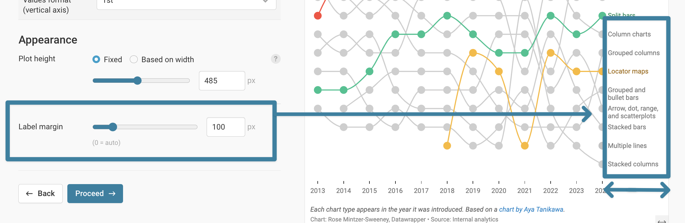
Increase the label margin to fit the text
By default, line labels are shown next to lines (you can change this in the Lines > Labels section). But sometimes, these labels can be quite long. To fit them inside the chart, scroll all the way down in the Refine tab to Appearance and then increase the Label margin.
Make sure to check your bump chart on mobile screens with the preview buttons below the chart. Line labels, for example, will move to the top on mobile.
Advanced: Use a scatter plot to add another dimension
The advantages of using a scatter plot compared to a line chart are outlined in more detail in the original blog post.
Here are some tips when creating a chart like this one:
When creating a bump chart with a line chart, you're drawing the lines and then adding the symbols on top along the lines. In a scatter plot, the thinking is the opposite — you first plot the symbols, and then connect the plots by drawing lines between them.
Plotting the symbols
To plot the symbols, your dataset should be in a long format. It should also contain the date (Years: horizontal axis), rank (Rank: vertical axis), and values (charts_published: symbol size), and a category column (chart_type: players in the ranking).

Drawing the lines
Once your symbols are plotted, you can connect the symbols with lines. You can learn more about how to draw lines in this article " How to connect scatterplot dots with lines".

One big advantage of using a scatter plot is the ability to customize the tooltips. With HTML and inline CSS, you can style the text, add extra information, insert charts and images, and more. Learn the details in this article " How to customize tooltips".
If you're stuck, have any questions, notice mistakes or have better ideas, reach out to us at support@datawrapper.de.