How to add tabs and drop-downs to your visualizations
"How can I create tabs or drop-down menus to show multiple views of the dataset?" This is one of the most frequently asked questions we receive. Now, Datawrapper does not have a built-in feature for adding tabs and drop-downs to switch between multiple chart/map views – and there's a reason for that:
Our focus is on features that empower you to tell author-driven stories with data as opposed to very interactive visualizations that hide data behind tabs and clicks. You can read more about our explanatory approach to visualization and why we don't offer filters and tabs in other Academy articles.
However, since we do get this question often, we've come up with a few workarounds:
Index
Both ways require you to write or adjust some HTML and CSS. The second approach also uses Javascript.
1. Add links to other visualizations
There's a lot you can do in Datawrapper using basic HTML and inline CSS.
1.1 Create buttons that link to different charts
You can use some simple HTML to create clickable buttons in the "description" section of your chart. Here, the blue buttons are actually links to separate Datawrapper charts showing data for each country.
To create this effect, you'll need to create six separate charts for Spain, Germany, Italy, the U.K., France, and Europe:

Publish all of them to get their Visualization only URLs.

Alternatively, once the charts are published, you can simply construct the 'Visualization only' URL by swapping out the chart ID of the following URL:
https://datawrapper.dwcdn.net/{Chart ID}/
Note: The number at the end of the URL is the versioning number and will increase every time you republish the chart. These numbers don't have to be included when copying the URLs of the published charts.
Then go back to Step 3: Visualize > Annotate...
 ...and paste the following code in the Description section of each chart where you would like the buttons to display. You'll need to replace the chart URLs in this code with the URLs of your own six charts. You can also change the style of the buttons by customizing their inline CSS:
Click on the buttons below to see data for the different countries: <br><br> <span style="line-height:30px"> <a target="_self" href="https://datawrapper.dwcdn.net/RxU9O/" style="background:#429ddd; padding:1px 6px; border-radius:5px; color:#ffffff; font-weight:400; box-shadow:0px 0px 7px 2px rgba(0,0,0,0.07); cursor:pointer;"> Spain </a> <a target="_self" href="https://datawrapper.dwcdn.net/FW0bo/" style="background:#429ddd; padding:1px 6px; border-radius:5px; color:#ffffff; font-weight:400; box-shadow:0px 0px 7px 2px rgba(0,0,0,0.07); cursor:pointer;"> Germany </a> <a target="_self" href="https://datawrapper.dwcdn.net/boIL8/" style="background:#429ddd; padding:1px 6px; border-radius:5px; color:#ffffff; font-weight:400; box-shadow:0px 0px 7px 2px rgba(0,0,0,0.07); cursor:pointer;"> Italy </a> <a target="_self" href="https://datawrapper.dwcdn.net/C3Er2/" style="background:#429ddd; padding:1px 6px; border-radius:5px; color:#ffffff; font-weight:400; box-shadow:0px 0px 7px 2px rgba(0,0,0,0.07); cursor:pointer;"> UK </a> <a target="_self" href="https://datawrapper.dwcdn.net/FP5mq/" style="background:#429ddd; padding:1px 6px; border-radius:5px; color:#ffffff; font-weight:400; box-shadow:0px 0px 7px 2px rgba(0,0,0,0.07); cursor:pointer;"> France </a> <a target="_self" href="https://datawrapper.dwcdn.net/vq9AT/" style="background:#429ddd; padding:1px 6px; border-radius:5px; color:#ffffff; font-weight:400; box-shadow:0px 0px 7px 2px rgba(0,0,0,0.07); cursor:pointer;"> Europe </a> </span>
Make sure that you're using the URLs labeled "Visualization only." (If you use the URL labeled "For sharing," the new charts won't appear directly in place of the main one.)

Each <a> tag is a link to another chart, formatted into a blue button using inline CSS. When the button is clicked, it opens that other chart within the same iframe. You can hover over the example chart and click "Edit this chart" to view and edit its code yourself.
Make sure to wrap each set of <a> tags inside a <span> and use inline CSS to set a good line-height. This will add some space between the buttons when they're split across multiple lines of text.
is an HTML code for a non-breaking space. This is what puts space between the buttons, so make sure to add one at the end of every <a> tag.
1.2 Create a group/ungroup button for bar charts
You can also use linked charts to create a group/ungroup option:
1.3 Filter by category in tables by pre-filling search query
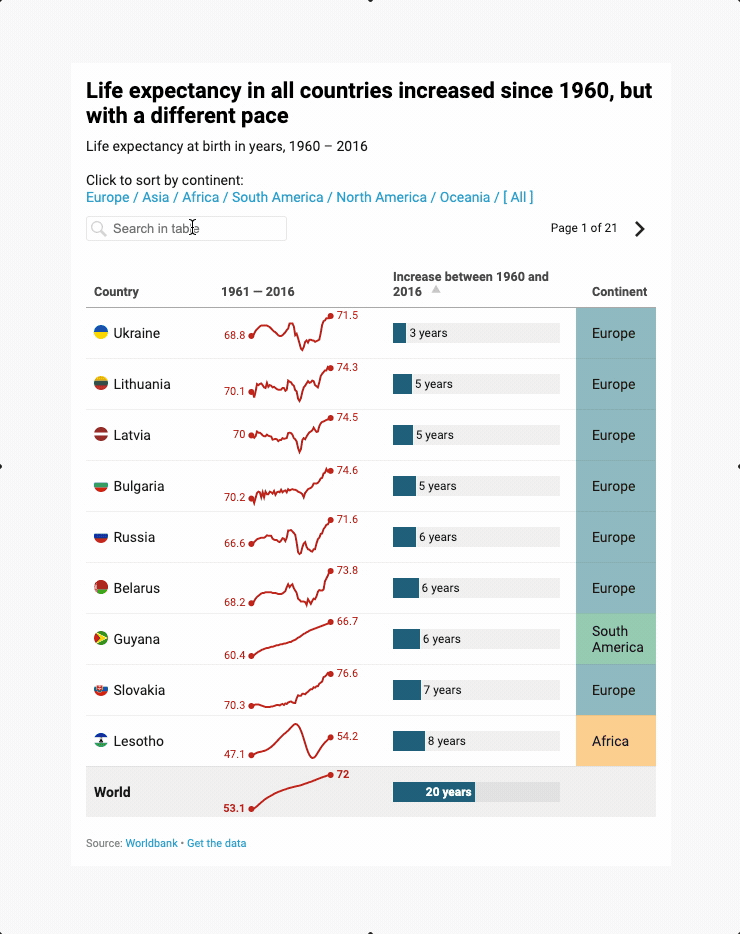
You can add a query string at the end of the chart URL that pre-fills the table search. For example, to filter by the continent "Europe", a URL to the table (chart ID: 98o03) could look like this:
https://datawrapper.dwcdn.net/98o03/?search=Europe
The code in the description for the table above looks like this:
Click to sort by continent:<br>

<a target="_self" href="https://datawrapper.dwcdn.net/98o03/?search=Europe">Europe /</a>
<a target="_self" href="https://datawrapper.dwcdn.net/98o03/?search=Asia">Asia /</a>
<a target="_self" href="https://datawrapper.dwcdn.net/98o03/?search=Africa">Africa /</a>
<a target="_self" href="https://datawrapper.dwcdn.net/98o03/?search=South America">South America /</a>
<a target="_self" href="https://datawrapper.dwcdn.net/98o03/?search=North America">North America /</a>
<a target="_self" href="https://datawrapper.dwcdn.net/98o03/?search=Oceania">Oceania /</a>
<a target="_self" href="https://datawrapper.dwcdn.net/98o03/“>[ All ]</a>
<br><br><br>
2. Build a custom UI around the visualization on your website or CMS
Another way to embed multiple visualizations and enable switching between views is to build custom tabs around the visualizations on your website or CMS.
Here, instead of buttons in the description, we've created a drop-down menu around the visualizations using HTML, CSS, and JavaScript. Take a look at the code in JSfiddle below:
And that's how you create custom tabs and drop-downs. If you have any more questions about this topic, don't hesitate to get in touch with us at support@datawrapper.de.